Here we go, boys and girls, the first pics of the packaging mock-ups for the Menchie's two-flavor-swirl frozen yogurt squeeze tubes!
Thursday, February 19, 2009
Tuesday, February 17, 2009
Proj. 1: digitals
I was trying to post a recap of what I brought in last time for the digitals critique for the packaging, but for some reason I'm having a real problem with my images on here. They're discolored, portions are missing, etc (real surprise). Anyway, I tried to do something different, adding a little more color (but retaining the white, the negative space), and focusing a bit more on the different flavors. There are three flavors now for the squeeze tubes: Kiwi/Strawberry, French Vanilla/German Chocolate, and Boysenberry/Original Tart. Here's what I have for the revised designs.
Ugh! Again, the colors are posting waaaay off and major components are not posting at all (nutrition facts, ingredients, mL). The jpeg looks fine on my comp, but something's lost in translation by the time it uploads to blogger. Anyone?...please?
Hopefully I can figure this out for you guys before I bring my beautiful little mock-ups on Thursday!
Project 1: stationery set
Here's a shot of the new stationery set I brought in last week, utilizing the Menchie's logo (slightly revised) and existing colors. I wanted to see what I could do with the revised logo and style to retain a playful vibe within a high-end product targeted mostly at adults and families.
Aaaaand, it looks like the colors are a little off in this post. No idea why (if anyone knows, that info would be much appreciated). Also, I sure wish these would post a little larger.
The cube (aka, why graphic design is my dysfunctional, abusive relationship)
So I had my neat little cube all ready to go over a week ago right before the deadline (my word was 'xenophobe'), and it was turning out pretty cool, I was happy with the direction...then, I dunno, life happened. Just as I was nearing completion, I kept getting an error every time I tried to save the file in illustrator. It just wouldn't save. I couldn't save in any format, export it, email it, save it to a jump drive - nothing. The best I can come up with is, I think there was a licensing issue with one of the many fonts I downloaded for the project. I had no way of knowing which one, and couldn't see any other option besides scrapping what I had and starting over. Even upon trying to open the previously saved file, I got a corrupt file error. So I snapped a pic of what I had done with the dig, kissed my little screen and waved bye-bye before closing out. I would've loved to start over (ok, maybe loved is a bit strong), but unfortunately I still had much work to do that same day, and sometimes you just have to keep moving forward. So without any further ado or excuse, here's what might have been / the cube dieline (the front would've simply said 'phobe' in small, simple typeface, with all the various 'xeno' fonts creeping in and around from the other side). I hope to revisit it for fun when I have more time.
Thursday, February 5, 2009
Still catching up...but I'm owning it.
So for those who don't know (or didn't care...*sniff*), I was out for a week and a half straight right after the new semester started due to some random stomach virus that had me vomiting all over the place for over a week. Good times. Anyway, I know I'm a little behind the rest of the class at the moment, but I'm hoping to get a lot done this weekend and be all caught up on Monday.
For now, here's what I have for Project 1 - Redesigning packaging for existing food/grocery product:
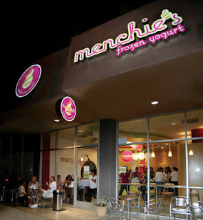
I've chosen Menchie's frozen yogurt as my product, store shown below on Laurel Canyon Blvd. in North Hollywood/Valley Village.
If you're not familiar with Menchie's, get the hell on the bandwagon now. Forget your Pinkberrys and your CeFiore nonsense. Menchie's is where it's at, yo. They have more flavors, more toppings (many are sugar free/kosher), and the best part is you get to server yourself. You basically run around the store, pulling all the levers like a Lucy and Ethel moment, mixing up as many flavors as you want suicide style. Then you pay by weight instead of toppings (that's where they get you - it sounds cheaper, but you try being reasonable in this fro-yo-fun-factory), then go home and violate your face. It's sick.
Anyway, they actually have an existing logo and style guide that I think are pretty successful, which you can see a bit of in the outdoor signage below.
What I'd like to do is take that and incorporate it into packaging, which they don't really have. Basically, they have white styrofoam and cardboard take-out containers for the yogurt, and that's it. You just slap a lid on and go.
I noticed they're expanding their stores nationwide, and I couldn't help but think about the product eventually ending up in freezers at supermarkets. I thought about a different approach than the typical ice cream container, and came up with squeeze tubes, sold individually or boxed. Maybe you've seen other products in similar packaging: thick, cylindrical shaped paper tubing, tapered at the bottom end with a pull 'n' peel paper lid at the top? Here are my first round of thumbs for the squeeze tubes, still a bit rough (and small - wtf, blog?), but as I said, I'm hoping to make great advances this weekend! :)
Above: the concept...I don't know what's going on with my scanner, sorry for the weird cropping.
More to come!
Better late than never...Let's begin!
For my packaging design class, I was asked to find and critique three examples of successful or good packaging design and three examples of unsuccessful design. Let's get the bad news out of the way first...
1. Kraft Singles (American Cheese)
Ah, Kraft singles...an American classic, unfortunately. Putting aside the fact that this once childhood favorite now makes me want to vomit at the thought, let's talk about the packaging design. First, the logo may be well known, but I think it could use a slight update. The packaging itself is so overcrowded without any real focal point or sense of flow, I'm not sure where to look first, much less next. I don't have a problem with the colors (though I'd like to see a clean and simple approach on white with much more negative space), but the design concept doesn't make me think of cheese in any way really. Not even overly-processed, hormone-pumped, preservative laced, plastic coated, trailer-cheese.
2. Admiration Pancake Syrup
Yeah, I've never heard of it either. But it looks like a bargain! Too bad I only buy my pancake syrup in racially insensitive epithet form. Admiration's web site promises the highest quality product at the lowest possible cost. Somehow I think that statement is more honest than it should be. Maybe I'm just a visual person, but I don't want to put anything in my body that looks like motor oil. If the distributor doesn't even care enough to at least try to fool my brain's impulse sensors into thinking this product is anything but mass-produced sugar syrup, I'm sure as hell not picking it up. Admiration? Really? What are we admiring, the sticker on the front of the plastic jug? The perfect symmetry of the stack of pancakes? At least they coordinated the color of the bottle cap with the logo.
3. Libby's Potted Meat Food Product
Let's start with something positive...I like how they've included "meat product" in big, bright, bold font, so there's no confusion on the consumer's part. If you're not familiar with potted meat, well, bless you. I'm only familiar with it because I grew up in the south, where hunting is not only your God-given right, but your duty as an American. And this stuff is often found in outdoor bags with other non-perishables. I've never actually tried it (I can only imagine that in some sort of Fear Factor circumstance), but from what I understand it's like Spam, only a thousand times more offensive. Anyway, we need to get Libby into the new millennium, folks. Doesn't this design look like something June Cleaver or Donna Reed would bring home and toss in the kids' lunch pails for snack time? I mean, I hope June would never give the Beave anything as disgusting as potted meat, but you know what I'm getting at (I told myself I was going to stop making fifty-year-old pop culture references after my last two dates didn't know who or what June Cleaver or Mayberry were, respectively...a friend said it aged me, but I'm only twenty-six, damn it! How do people not know these things?). In all seriousness though, is there really anything more unappealing than vague meat? I mean, what the hell's in there, horse? Dog bits? Who knows...
Now, for the GOOD stuff!
1. Archer Farms (various products)
Here we have Target stores' own in-house brand of all-natural foods in attractive, clean and consistent packaging that appeals to the slightly more health-conscious consumer looking for higher-end products. The logo and earthy tones used work well for the brand. And though you can't really tell from the pic, the box design of those cookies and even the chip bags are well-designed. The cookie boxes are easy to open and close with the slide of a tab, all the while keeping the cookies fresh in a foil bag. And the chip bags are pretty innovative too. I'm not sure if this is the first time I've seen it, but it's definitely one of the first brands to utilize the zip-lock-like seal as an opening on the front across the top of the chip bag. I sound like such a dork, I know, but buy a bag and open them up. I swear you'll say, "Oh that's pretty cool." I personally really dig Archer Farms' products. Forget the packaging for a minute, whoever is designing the menu for the range of products is an artist. It reads more like a list of foods you'd expect to see at Trader Joe's or Whole Foods. And it's inexpensive to boot. Check out the yummy - there's even an Archer Farms Organic line!
2. Pom pomegranate juice & Pom Teas
Memorable brand logo. Eye-catching, attractive, easily recyclable bottles. Simple and successful. I might personally change the logo up a bit (I've never been a fan of the heart), but other than that, I think it's perfect. I think people like the pomegranate juice bottle for it's uniqueness, and I know a few who keep the Pom Tea glass/jars to use as drinking glasses. Hey, it's LA. We're crawling with struggling artists here.
3. Wolfgang Puck Pizzas
Nice focal point, excellent photo of the product, great use of negative space, classic logo, eye-catching, bright colors (yet still appropriate)...nice. Great. Now I want pizza.
There you have it guys and gals. And if you think my selections were a little biased based on my own tastes, well, you're probably right. But as always, everything I said is still true. So nyah.
Subscribe to:
Posts (Atom)